
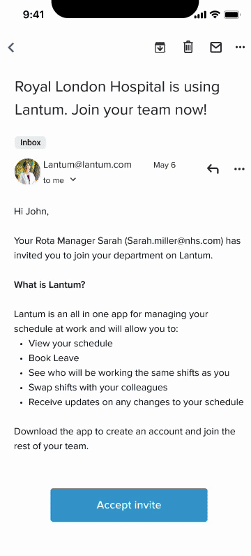
The Lantum app is a scheduling app for doctors to see an overview of their shift schedule, book leave and swap shifts. It had no clear onboarding journey, training or activation for clinicians. The existing process of onboarding clinicians in the backend meant our operations team were setting up clinicians individually on the app with a dummy password and prompting them to reset their password themselves. This was not scalable or streamlined and gave an odd first impression of the app for new clinicians.
The Problem
We highlighted the problem from the clinician perspective:
As a clinician I want to have a clear onboarding to the Lantum app so I can easily sign up and understand its value to me.
The Solution
I developed a full onboarding flow for clinicians with an introductory email, verify account flow and password creation. This would enable users to have a warm start with our app and give them clear indication of what Lantum is and how it can be of value to them.
Discover
As a business we had an aim to scale our operational tooling process and solve user needs for clinicians. Creating a better onboarding experience would take this workload off the operations team to set up users and also solve the user need to be introduced properly on our product, with full knowledge of what the app can do.
We conducted some user research with clinicians to understand more about their views towards being introduced to new scheduling tools, and how they handle new software as they move through new rotations. My Product Manager and I carried out five user interviews. And discovered the following findings:
-
Nothing is really centralised in one software and as you rotate, you have to accept every department will have its own niche
-
The main thing people cared about was how easy new software was to use, one clinician said ‘I want to know up front if it makes my life easier, and how’
-
In come cases new software was introduced to streamline processes, ‘but you would still have to chase up leave requests with your rota manager in person’
-
New software would be introduced but ‘old habits die hard’ and Rota managers and clinicians would go back to using excel spreadsheets to manage things. These were often not up to date and not accessible.
I also tested a low-fi onboarding flow, to gather feedback from clinicians on my initial ideas. This highlighted:
-
Users care that the introduction to new software comes from legitimate emails/trusted sources.
-
They care about what it can do for them ‘If it manages leave request I’ll download it’
-
They appreciated the overview of Lantum’s main features in the onboarding,
-
They appreciated the about you page, giving them a grounding in the app and information about their department.
-
They flew through the password set up and were excited by the home view of their schedule.
-
Most user testers said they would like to click around and figure out how to user the app themselves for a quicker onboarding, and asked for more clarity around the colour of shifts on the app to indicate on-call shifts, weekends and long days.
Define
Once we gathered this feedback, it was clear from the research we needed to focus on being transparent, informative and to the point in our onboarding journey, to make it clear what Lantum can do for clinicians and ensure they trust it as a resource.
Develop
I had my testing prototype to work on and was able to take user feedback into account to refine it further. I produced multiple versions of these designs, and took them to be critiqued by my wider design team, as well as gathering feedback from the operations team and developers.
I polished the designs further, and removed the ‘About you’ page from the original prototype, as it became clear we could not pull these information fields due to the way our data model existed for clinician information. I made a note that this could be something to add back in in the future.
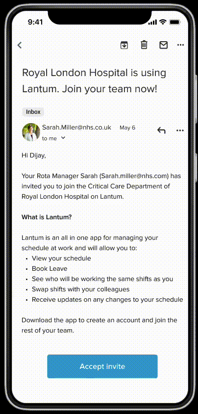
Also, while refining this with engineers, I iterated again on the designs to include the addition of a one time password being sent to the user to verify the account, this was at the request of the developers to ensure the journey was more secure. I also included a gif at the end of the journey to prompt users to sign up to notifications, demonstrating how these would be helpful to manage leave, swaps and new shifts.

Deliver
After my designs had been validated by users and iterations completed, I created a handoff document for developers featuring the specs for the onboarding screens and any new components. I also made sure to account for any edge cases I could think of, taking into account ‘forgot password’ journey’s or verification code expiry.
I delivered a complete onboarding journey which at this point has been built but not yet shipped.

Learnings
-
Not overcomplicating things: Like any other onboarding journey, the key here was to keep things simple. I wanted to add in extra helpful bits of information but had to reflect on the research findings that users wanted this journey to be simple and transparent.
-
Collaborating with developers: I really enjoyed working with my team of developers on this one as their technical knowledge of how an email invite to the app could include a dynamic link, linking the users email account to their Lantum account and knowledge of security processes really enhanced the project. Discussing technical constraints and possibilities with them was incredibly helpful.
More case studies


